Hover
A hover effect for a gallery of images
Installation
Run the following command
It will create a new file hover.tsx inside the components/gallery/hover.tsx directory.
mkdir -p components/gallery && touch components/gallery/hover.tsxPaste the code
Open the newly created file and paste the following code:
"use client";
import { cn } from "@/lib/utils";
import { AnimatePresence, motion } from "framer-motion";
import { useState } from "react";
type Element = {
id: number;
bg: string;
img: string;
};
const HoverGallery = () => {
const [isHovering, setIsHovering] = useState(false);
const items = [
{
elements: [
{
id: 1,
bg: "#22c55e",
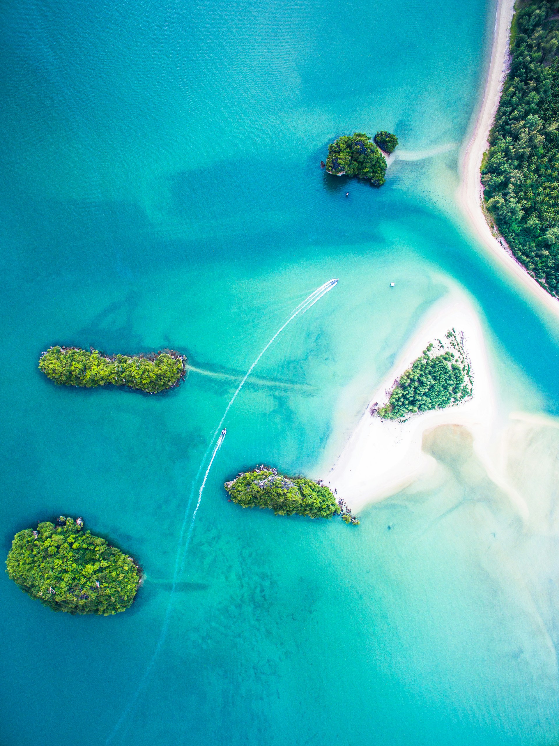
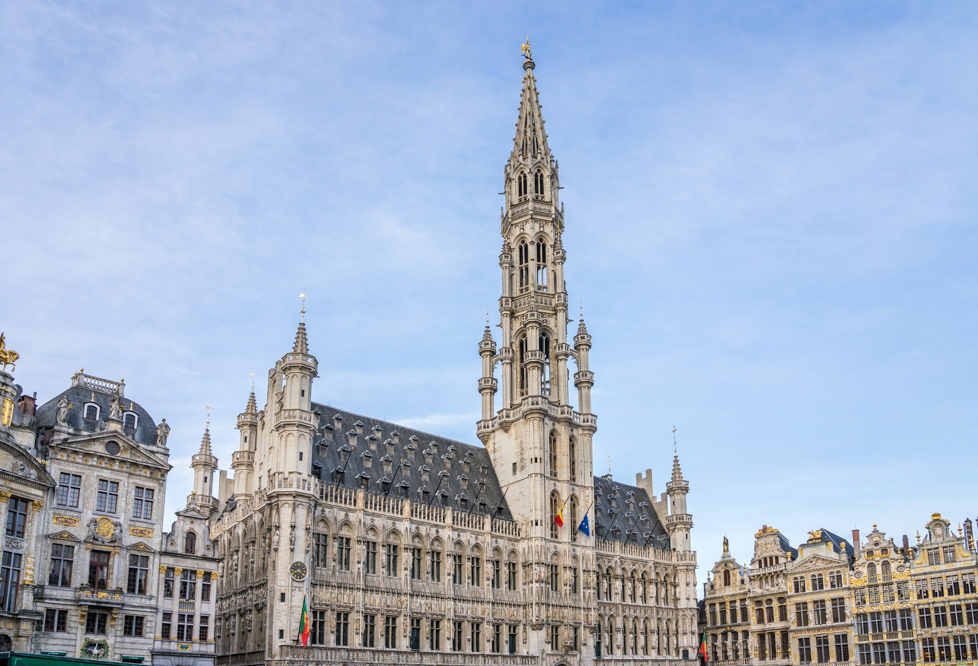
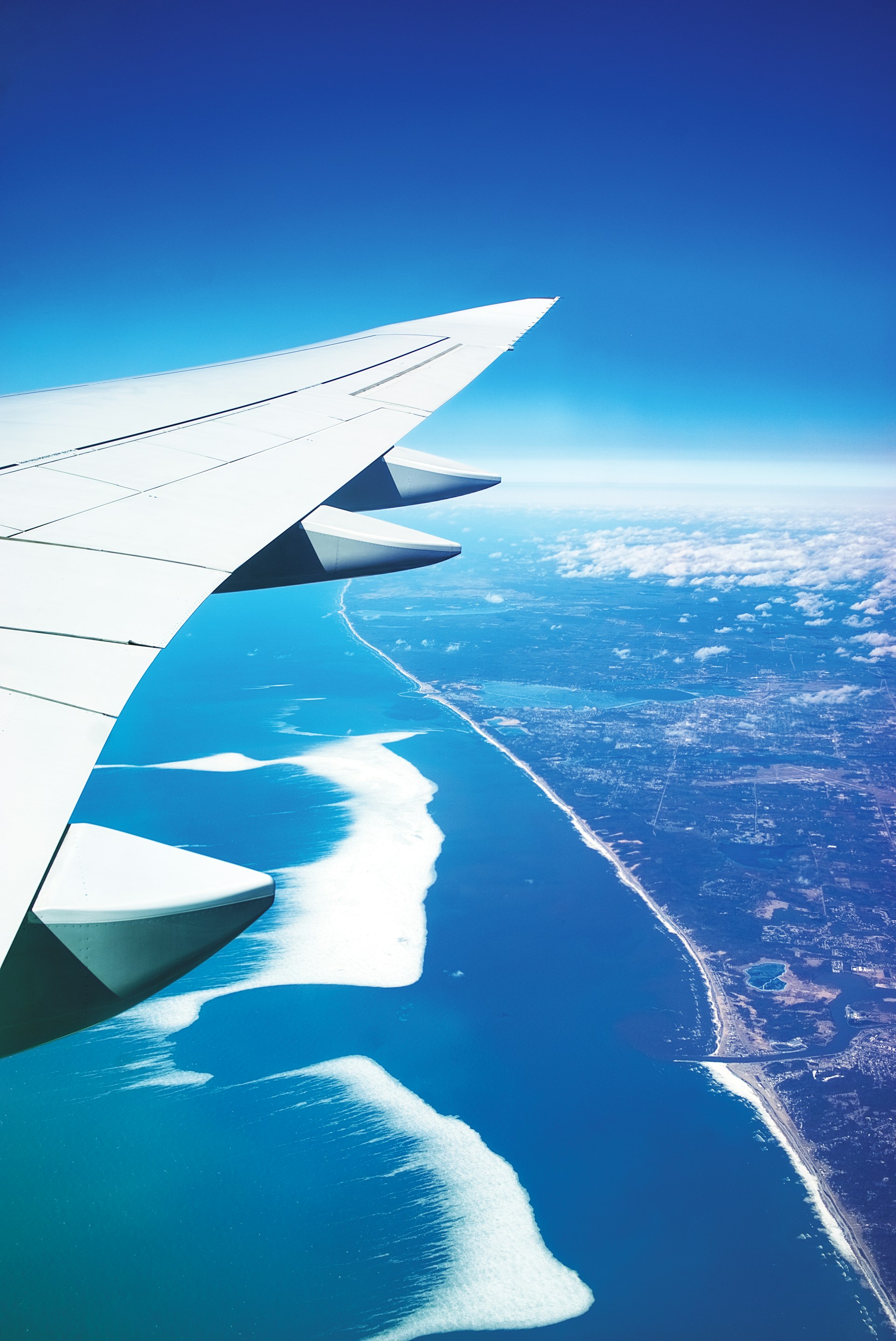
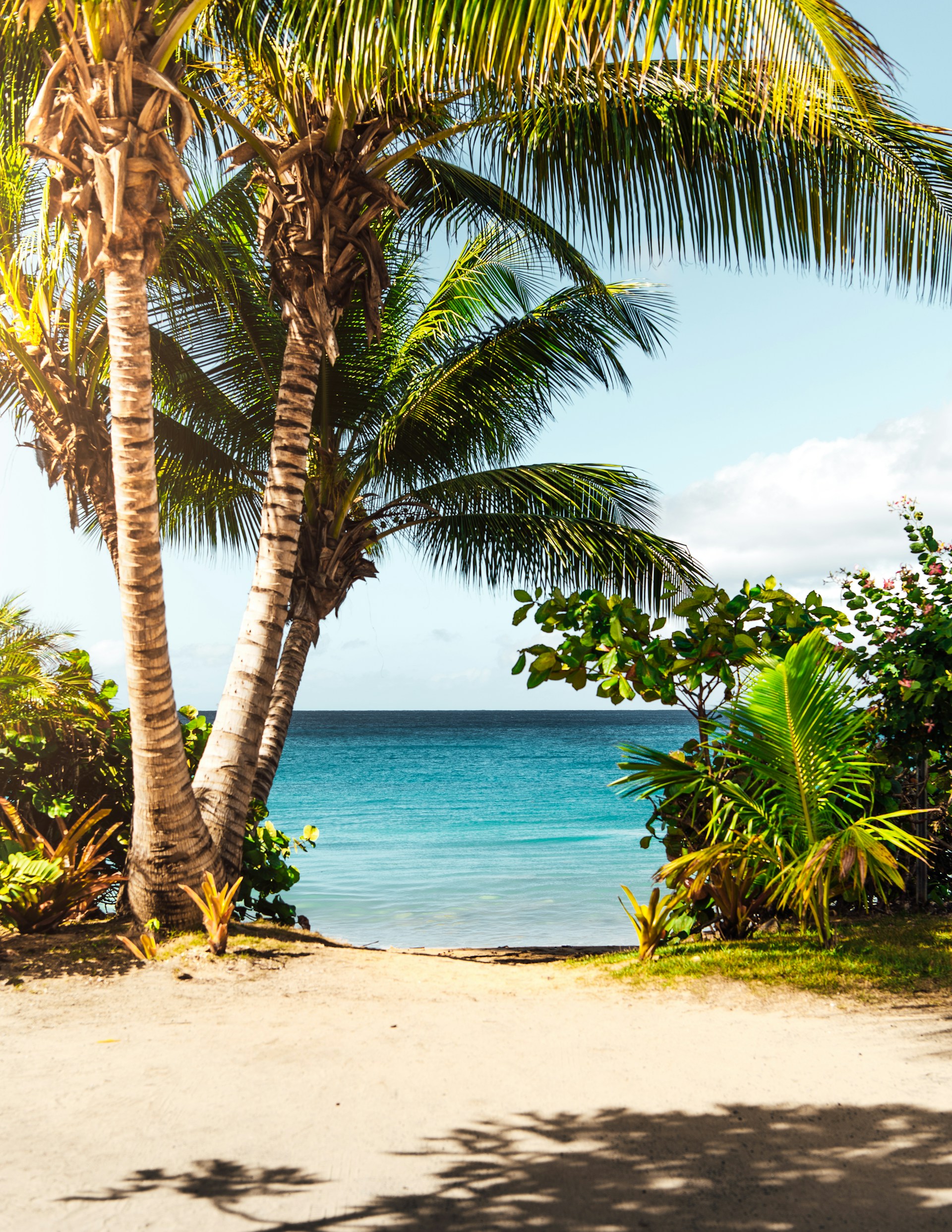
img: "/others/photo-1.jpg",
},
{
id: 2,
bg: "#ef4444",
img: "/others/photo-2.jpg",
},
{
id: 3,
bg: "#eab308",
img: "/others/photo-3.jpg",
},
],
},
];
const allElements = items.flatMap((column) => column.elements);
const elements = [
...allElements,
{ id: 4, bg: "#3b82f6", img: "/others/photo-4.jpg" },
];
return (
<div className="size-full center">
<motion.div
onMouseEnter={() => setIsHovering(true)}
onMouseLeave={() => setIsHovering(false)}
className="h-[500px] w-[500px] border rounded-[30px] px-4 py-5 relative overflow-hidden"
>
<motion.div
className="w-full h-full gap-2 flex flex-col items-start justify-center"
layout
transition={{ duration: 0.5, ease: "easeInOut" }}
>
{items.map((column, index) => (
<motion.div
className={cn(
"flex flex-col items-center justify-center gap-10 w-full h-full"
)}
key={index}
layout
animate={{
opacity: isHovering ? 0 : 1,
willChange: "auto",
}}
>
<div className="rounded-2xl cursor-pointer grid place-items-center flex-[2] w-full">
{column.elements.map((item, index) => (
<Gallery item={item} index={index} key={index} />
))}
</div>
<motion.div
className={cn(
"rounded-2xl cursor-pointer center overflow-hidden border h-full w-full flex-1"
)}
layoutId={`box-4`}
>
<img
src="/others/photo-4.jpg"
alt="nothing image"
className="size-full object-cover"
/>
</motion.div>
</motion.div>
))}
</motion.div>
{isHovering && (
<motion.div
initial={{ opacity: 0 }}
animate={{ opacity: 1, willChange: "auto" }}
transition={{ duration: 0.5, ease: "easeInOut" }}
className="absolute inset-0 w-full h-full overflow-hidden "
>
<AnimatePresence mode="popLayout">
<motion.div
className="grid grid-cols-2 gap-4 justify-center items-center h-full w-full p-4"
animate={{ opacity: 1, y: 0 }}
transition={{ delay: 0.3 }}
>
{elements.map(({ id, bg, img }, index) => (
<motion.div
key={index}
className={cn(
"rounded-2xl cursor-pointer center overflow-hidden border h-full"
)}
layoutId={`box-${id}`}
>
<img
src={img}
alt="nothing image"
className="size-full object-cover"
/>
</motion.div>
))}
</motion.div>
</AnimatePresence>
</motion.div>
)}
</motion.div>
</div>
);
};
const Gallery = (props: { item: Element; index?: number }) => {
return (
<motion.div
className={cn(
"rounded-2xl center border h-[80%] w-[80%] max-h-[222px] origin-bottom overflow-hidden"
)}
layoutId={`box-${props.item.id}`}
animate={{
rotate: props.index === 0 ? -12 : props.index === 2 ? 12 : undefined,
}}
style={{
gridRow: 1,
gridColumn: 1,
backgroundColor: props.item.bg,
}}
>
<img src={props.item.img} className="size-full object-cover" />
</motion.div>
);
};
export default HoverGallery;Credits
Built by Bossadi Zenith